

Release & Reception
Released for Oculus Rift & HTC Vive
Conjure Strike was released for both the Oculus Rift and HTC Vive. It has received a 4.6/5 user rating on the Oculus Store. It’s success resulted in our team being flown out to Facebook in Menlo Park to speak at the 2018 Oculus Launchpad event.


Research & Analysis
Optimized for VR best practices
Due to the speed and complexity of Conjure Strike’s gameplay mechanics and interactions, I did thorough research on the best practices of VR interaction designs and methods to nausea prevention. One of the most helpful resources was the Oculus VR Best Practices guide.
competitive Analysis
TribeVR clearly identified Blizzard’s Overwatch as the main precedent for Conjure Strike’s gameplay. Overwatch provided a clear sense for the style of fast paced gameplay TribeVR wanted, but I needed to conduct competitive analysis of of other VR first-person experiences to figure out how to best translate that experience to the Oculus Rift's unique interface. Some of the games I looked into were The Unspoken, Super Hot, Gorn, and Adr1ft.


Prototype Play testing & Key takeaways
TribeVR came to me with an initial prototype for Conjure Strike which provided me with a rough idea for the type of game they were striving to create. We used this prototype to conduct several play tests to see what sort of pain points were emerging for both for UX and game design. Here are several of the most prominent key takeaways from play testing.
Players found it annoying and distracting to check health bar, especially during action.
It’s difficult to move my character around, and it’s causing neck strain.
Players don’t know where to go during gameplay, and level objectives are unclear.
It’s difficult to change spells quickly during gameplay.
meet our persona, Eric the esports gamer
In addition to our our play testing, I conducted user interviews with competitive gamers that played online shooters and VR games. I then distilled all of these findings into the persona, Eric The Esports Gamer.

Needs
Likes fast paced action mechanics with precise controls and UX that best supports these mechanics.
Owns a high end PC for playing games.
Was an early adopter of VR.
Primarily plays online competitive games (Fortnite, Overwatch, and League of Legends).
Pain Points
Dislikes cumbersome interfaces and interaction design that impede gameplay.
Dislikes games that emphasize high fidelity graphics over communicating vital gameplay information.
Dislikes shallow gameplay mechanics.
ideation & design
Player Health bar HUD
One of the prominent frustrations that players reported with TribeVR’s initial Conjure Strike prototype, was that they found it annoying and distracting to check health bar. In the prototype TribeVR had attached the user’s health bar to their left hand. This design was cumbersome for players, because if a user wanted to check their health, they would have to look down at their hand or bring it into camera view. This design was an issue during intense action, because it conflicted with a player’s need to freely aim with their hands to move their characters and cast spells. In addition, from my user interviews I came to understand that it’s crucial for competitive players to have UX that provides players with an immediate grasp of important game mechanics at all times in competitive games.
I redesigned the health bar system, by making it a green bar at the upper edge of player’s viewport. This allows for the healthier to be unobtrusive, but still visible at all times during gameplay.

User’s health bar visualized as a green bar at the upper edge of user’s view
A modern VR game with classic controls
In the initial Conjure Strike prototype, TribeVR had created a system where certain spells could be case with the left hand, while other spells could be case with the right hand. Additionally, all movement mechanics were controlled with the left joystick. This caused confusion for players because it was often difficult to remember which spells were connected with which controller.
After multiple iterations of the controller layout, it became apparent that all character movement should be assigned to the left Touch Controller, and all action buttons (casting spells) should be assigned to the right Touch Controller (with an option to switch hands for left handed players). This design allows players to easily move and aim independently with each hand. What works so well about this design is that it mimics the familiar dual stick shooter control layout that that many players are already familiar with in FPS games.
Movement system controller layout
TribeVR wanted a movement system that allowed players to fly through the air in any direction with complete freedom of movement. In TribeVR’s initial prototype, the movement system was controlled by players were looking in the direction they wanted to move, and then pressing forward on their controller. This design worked well in certain scenarios, but it issues were arising when players wanted to move up and down at acute angles. For example, if a player wanted to fly directly up, they would need to crane their neck back and press forward on their left joystick. This resulted in numerous play testers commenting on having neck pain after long play sessions. Additionally because players would need to look where they were moving made it difficult for players to move and shoot spells in opposing directions.
After several iterations we designed and implemented a system where players can control their flight by simply pointing in the direction they want to move, and pressing forward on the left joystick. Moving backwards and strafing left and right are also controlled by the same joystick. This allowed for players to easily move and shoot in opposing directions and releaved neck strain issues.

waypoint system HUD
Conjure Strike features several different levels. In every level, each team of players has an energy core in their base that they must defend from the attacks of opposing teams. During our play testing many players reported that they had difficulty locating enemy bases. This caused players to wander about aimlessly through levels as they sought their objective. To remedy this issue, I purposed two different designs for waypoint systems to guide players through the levels, and provide insight about the state of their objectives.
The fist waypoint system is visualized as a 3D ring that hovers around the user at chest level. This allows it be be easily visible with a slight glance down, but not in the way of gameplay. The main waypoints in the game are attached to the ring, such as your base’s health, and capture the flag locations. As the user looks around, the ring remains static, but the waypoints rotate around the ring, indicating which direction they are in relation to the user. If the waypoint is completely out of the user’s view, the waypoint visualized at the edge their view pointing to the direction the user would need to rotate in order to be facing the waypoint. This design is more reminiscent of the UI found in games like Doom VFR or Skyrim VR. We ultimately did not use this design because it seemed to favor gameplay that moved along a horizontal spaces, whereas Conjure Strike allows players to fly in any direction with complete freedom of movement.

First waypoint system
The second waypoint visualizes the UI floating in 3D space in the direction of the waypoints they represent. If the waypoint is completely out of the user’s view, it is visualized at the edge their view pointing to the direction the user would need to rotate in order to be facing the waypoint. This system is similar to a traditional FPS like Overwatch. We settled on this second waypoint system because it was a better fit for Conjure Strike’s movement system that allows for freely fly through the air in any direction. Here is an illustration visualizing how this second waypoint would look in game.

Second waypoint system
In addition, the in game waypoints have important states that need to be conveyed to the user. For example, in this case the crystal core is an in game location that needs to be protected by a user. I created various states to show the condition of the core to players that can easily fit within the waypoint system as its energy is drained.


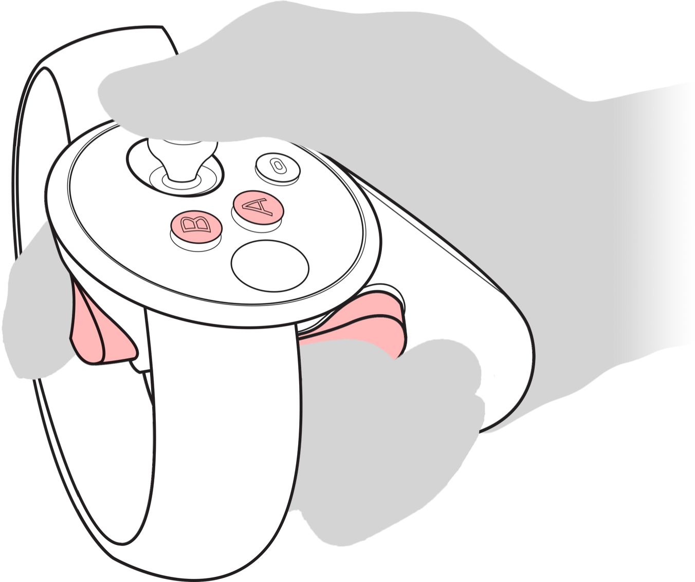
spells controller layout
In Conjure Strike players have access to 4 spells they can use to defeat their opponents. It's vital to the gameplay that players be able to use specific spells with split second precision. In the initial Conjure Strike prototype, TribeVR had implemented a design where each spell was associated with a wand. The player could only hold 1 wand at a time, and in order to switch spells, players were required to look down and use their Touch Controller to grab from 4 wands floating at their waist level. Unfortunately the design was cumbersome, and prevented players from enjoying the quick Overwatch style gameplay they aspired to have with Conjure Strike. I realized this was a problem during play testing when players would stop moving amidst the fast paced action to look down and focus on grabbing at their wands to switch spells. This often resulted in the user being killed or completely missing the opportune moment they had been switching spells for to begin with.
I completely redesigned this system by removing the wand switching completely, and instead I mapped the user’s 4 spells to the right Touch Controller’s 4 buttons (2 face buttons and two triggers). This allowed for the entire arsenal of spells to be accessible at anytime. My design was validated during play testing sessions, as the matches became much faster paced and engaging. Here is an illustration of where I mapped the players 4 spells on the Touch Controller’s buttons.
Spells states HUD
I created a system where the user’s spells and cool down timers are visualized as icons that track weapon on screen at all times (See the “Simplified cool down timer system” section below for more information on cool down timers). This allows for a user to have an immediate understanding of which spells were connected to which buttons, and the status of their cool down timers. The reason I designed a system where the icons track their weapons, is because I noticed during play testing that players often look where they are aiming their spells. This way, whenever a user is aiming a spell, they are also being informed about a spells status.

Cool down timers visualized as icons tracking a player’s on screen weapon
In addition, when a player moves their weapon offscreen, the cool down timer icons lock into the lower right edge of user’s view, which allows the information to remain onscreen at all times.

Cool down timer icons locked into the lower right edge of user’s view
Simplified cool down timer system
TribeVR’s initial prototype had a complex system of resources associated with casting spells that was distracting from the fast paced Overwatch gameplay we wanted. The resources it had were mana, ammo, cool down timers, and charges. Mana was a universal ammo that was drained whenever a spell was cast. Ammo is similar to mana, but only used for a specific spell. Charges dictate the amount of uses a spell has before the cool down timer is initiated. A Cool down timer is a timer that initiates after a player runs out of spell charges. Cool down timers prevent the player from casting the same spells in quick succession.
I noticed during play sessions that having soo many resources to manage was confusing for players. Keeping track of these resources, and remembering how they interacted with one another become a chore that distracted players from the fast paced action. I redesigned this system by removing the mana and ammo, and focusing only on charges and cool down timers. My simplified design drastically reduced confusion for players and increased the speed of gameplay. In my design the number of charges varies between spells, which are visualized as segments on a ring around a spell's symbol. Below are a few examples of how this is visualized.


The system has varying visual states that display its status. Every time the user casts a spell, a segment is depleted and greyed out on the ring. But these charges are constantly recharging, which is visualized by a red progress bar that fills up the charge segment. If a user uses all of the spell charges, the spell becomes temporarily unvailable until a charge segment refills.

These cool down timers are visualized around the players wand during gameplay, which provides players with quick access to information about the state of of there spells at anytime during gameplay.

Spell Interactions
In Conjure Strike, players can choose from 5 different character classes, which each have their own unique spells design. The Conjure Strike team wanted me to explore spell casting interactions that would take in account the Oculus Touch Controller’s velocity, direction of movement, and how far it has moved.
To accommodate this request I created a design that makes use of on screen visuals to emphasize the states of the interaction to provide feedback to the players. In this design the user initiates the spell with an “on button press”, which visualizes a semi transparent ring around the players hand. As the user moves from the center of the ring towards its edge, a red cone is visualized that represents the velocity, direction of movement, and how far it has moved. When the user’s hand moves fast enough and far enough to connect with the edge of the ring, the fan of blades spell is cast. Here is a diagram of how this interaction is visualized.


In addition to the ring visualization, I created user flows that show how sound, visuals, and haptics are used to illustrate each step in the interactions user flow. Here is an example of a user flow I created for the Mage Hunter’s “Fan of Blades” spell.

First spell user flow for the Mage Hunter’s ability Fan of Blades
User testing showed that this spell interaction had some usability issues, but we ultimately ended up shipping the design because it favored faster paced gameplay and due to time constraints. The main issue that emerged with the first spell user flow was that user’s had difficulty mastering the nuances of triggering their spells based on movement. This resulted in players often having difficulty aiming spells because they were often triggered too early and too late.
To address these usability issues, I created a second spell user flow that abandoned the complex variables of the first user flow. Instead it focused purely on the Oculus Touch Controller’s velocity, direction of movement, and an “on button release” to cast a spell. From my testing results I found that providing players with clear binary states that are initiated with a “on button press” and “on button release” allowed players to have clear precision around aiming their spells. This design was also precedented and used to great effect in the game Unspoken Arena.
In this design the user initiates the spell with an “on button press”. As the user moves their controller the controller fast enough in initiates a haptic buzz, letting the user know they can release the button to cast the spell “on button release”. Here is a diagram of how this interaction is visualized.
Second spell user flow for the Mage Hunter’s ability Fan of Blades